Walk into a scene from Common Side Effects, and you can almost bet a paycheck there’s a secret conversation happening – right there in the background colors! These aren’t just random shades filling empty spaces. The show’s creative wizard and art director, Camille Bozec, decided every splash of color had a job to do. If you’re not seeing what she’s saying? You’re only catching half the story. Let’s throw away the beige and dive into the psychedelic rainbow of storytelling that’s coloring every moment of this wild ride.

Mood Lighting: Color as an Emotional Thermostat
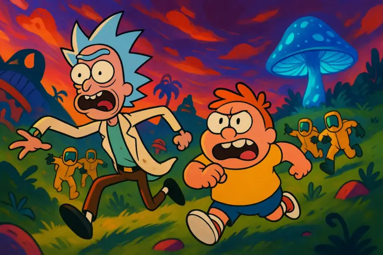
Ever notice how the world seems to shift around Marshall not just in dialogue, but in everything from the wall paint to the sky outside? On a breezy day when hope is alive and the mystery of the Blue Angel feels conquerable, Bozec dresses the scenes in golden ochres, cozy browns, and punchy greens. Think sunlight on a forest walk – you can feel Marshall’s chest unclench a little just watching it.
But then, wham! Trouble stirs, mushrooms get weird, or that pharmaceutical chill settles in, and everything cools down fast. Suddenly, you’re surrounded by steel blues, gloomy slates, and the kind of grays that practically fog up the screen. Bozec herself had a blast balancing the temperature. In a recent behind-the-scenes scoop, she said, “We wanted everyone on the couch to feel what Marshall feels – without Marshall ever spilling his guts out loud.” Mission accomplished. By flipping the color switch, she turns his internal chaos into something the audience not only spots but feels deep in their own bones.

Corporate Cold, Counter-Culture Hot: Drawing Lines with a Paintbrush
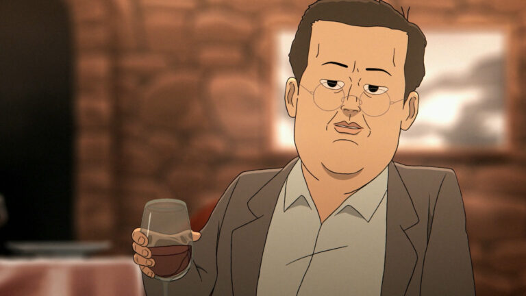
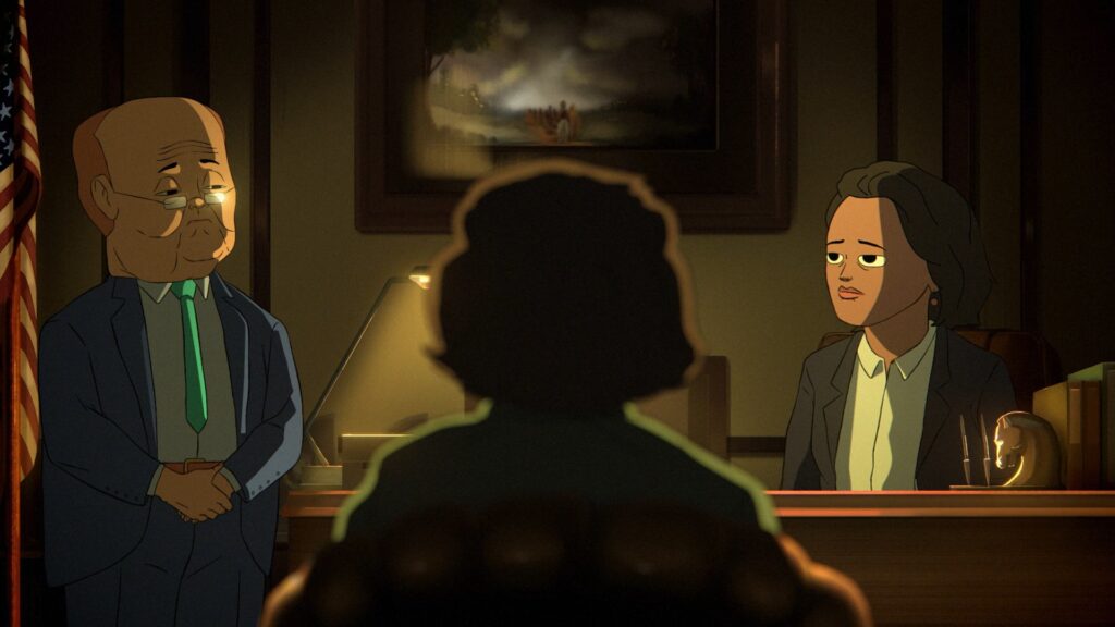
Here’s something easy to miss unless you’re glued to every frame: Bozec uses color to split the show’s warring worlds. Step inside the glassy headquarters of Reutical Pharmaceuticals and you might catch your own reflection. That place is wall-to-wall ice – stark whites, hard silvers, and that fluorescent lighting that makes even a happy goldfish look like it needs therapy.
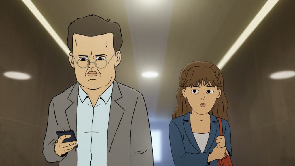
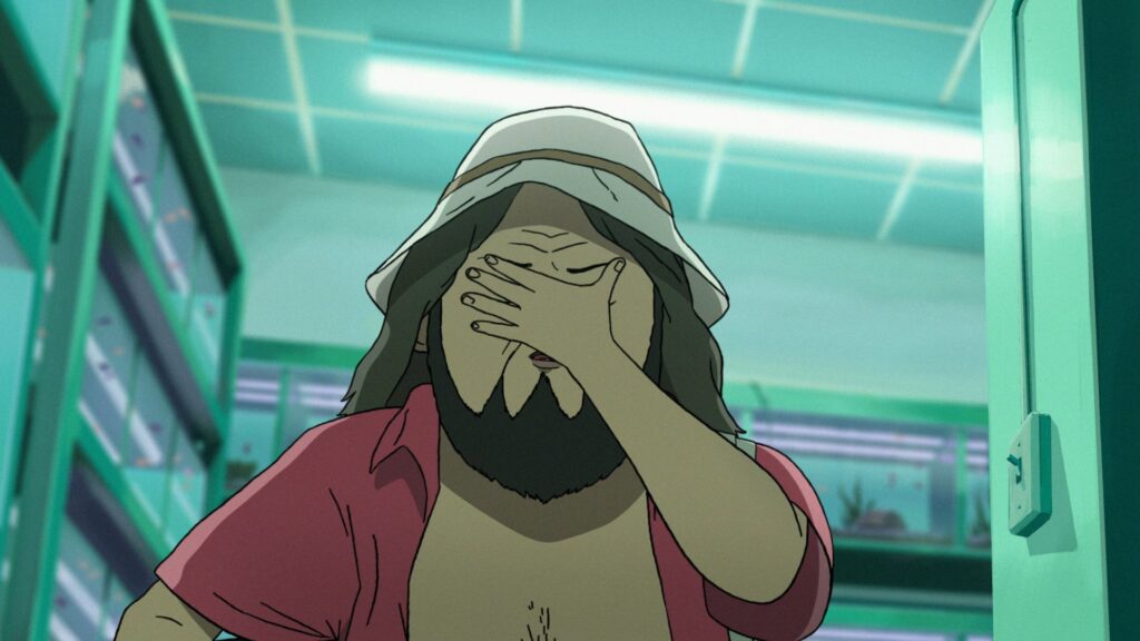
Now, jump-cut to the counter-culture lair. Instantly, you’re in another universe. Warm terracottas, wild oranges, leafy greens. The characters here seem to pulse with life, not just plot. Bozec told BubbleBlabber a clever detail: “We leaned on color like a line in the sand. Reutical thinks they’re running a clean operation, but the counter-culture people? They’re messy, alive – that had to come through with color first, not just dialogue.” You notice it more and more: the company men always look pale, a touch ghostly. The rebels nearly glow like vintage lava lamps.
Reading the Room: Plot Twists in a Paint Swatch
Color is more than just environment. Sometimes, it whispers hints about what’s next. Dig this: anytime a certain subdued purple creeps onto the screen – maybe in the shadow of a file cabinet, maybe in the haze behind someone’s head – it’s the show’s sly wink. Bozec gives the inside scoop here, too: “That’s our nod to the Blue Angel Mushroom. Anytime that tone pops up, trouble isn’t far behind.”
Watch Episode 5 for a textbook case. Marshall reads a mysterious file under what looks like a regular desk lamp. But freeze the frame, and there’s that purple. Next episode, the mushrooms hit the fan. Coincidence? Not a chance. Color as a fortune teller – that’s the trick.
Spray-painting Emotion: Hot, Cold, and Every Shade Between
Colors in Common Side Effects don’t just say where you are – they say how you should feel about being there. Here’s a flavorful breakdown:
- Warm Tones (orange, red, deep green): Party time, humanity, hope, and when things get personal.
- Cool Tones (blue, gray, sickly teal): Anxiety, corporate drones, or when you know someone’s being hunted.
- Acidic Accents (neon greens, fuchsia): Hallucinations, danger, moments the story tilts into the surreal.
The show doesn’t mind mixing palettes, either. A boardroom scene tipped with an odd hit of magenta? Usually means something from the outside world is about to crash the clinical calm – and the viewer’s heart rate probably ticks up in response.
The Science and Savvy Behind Every Palette
Bozec isn’t just picking pretty colors. She loves a bit of cognitive science, too. Colors mess with brains – and emotional receptors – without viewers even realizing. In a May 2025 interview, she spilled the method: “Warm colors open viewers up emotionally; cold ones make us more skeptical – sometimes even tense.” So, even if Marshall isn’t shouting “I’m panicking!” your stomach knows, thanks to a queasy turn in the background hue.
Not to mention, color blocking can control where your eye goes. Big showdown in the lab? Watch how the whole room fades into white and the important prop – maybe a crucial mushroom or a flash drive – suddenly glows yellow or blue smack in the middle of the frame. Viewers can’t help but lock onto it.
Fan Theories: What Else is In the Mix?
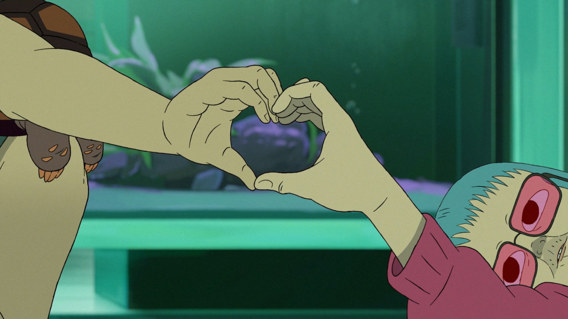
Of course, no modern TV show slips color tricks past Reddit. The r/CommonSideEffects crowd has gone wild with color decoding projects. Some suspect every shift in Marshall’s hoodie palette foretells which side he’ll help in the next conflict. Others connect Frances’ lipstick shade to her willingness to break company rules. And let’s not forget Mr. Socrates, the tortoise with the changing shell tone – according to fans, shell patterns echo the mood of every episode he waddles through. That might be a stretch, but Bozec hints, “Fans noticing these things make us smile. They’re watching the show on another level.”
Behind the Curtain: Collaboration on a Chromatic Scale
Don’t think it’s all Bozec and her pencils. The color team chats constantly with the writers, directors, and even sound designers. Lighting cues from script meetings, for example, guide not just the animators but also the colorists. They work together, painting emotional beats as carefully as they write punchlines. Showrunner Steve Hely revealed in March, “Some color decisions shifted entire scenes. One scene landed as tense only when we cooled down the blue in post-production. We test-screened it, and the audience literally squirmed more.”
Corporate World: Steel and Sanity or Sickness?
Reutical isn’t just cold – it’s a little nauseating on purpose. Bozec and team dialed up the blue-greens, a color zone where fluorescence meets hospital scrub. That specific teal winks at medical environments but also unsettles, much like winding up in an ER at midnight. When the show wants to signal danger in disguise, watch for a flicker of acid green on a screen or glass of water. It’s never just background – always a warning.
Counter-Culture Hideouts: Why the Warm Matters
The rebels’ world, meanwhile, is the opposite. Shag rugs, brick walls, patched-up armchairs – every surface comes with lots of red-brown or golden light. Frances seems more at home there, her hair catching every tint of orange when the story tips in her favor. This isn’t just a comfort zone – it’s a pocket of realness, where you can trust most of what you see and hear, at least until the next plot twist.
Beyond the Frame: How Viewers Feel (Without Knowing Why)
The ultimate party trick here isn’t that color sits in the background. It’s that when Common Side Effects yanks you from safety to alarm, your gut feels it first. Colors amp up the suspense, lull you into warmth, or make you squirm with unease – even before a single mushroom changes hands.
So next episode, keep an eye on the palette. That’s not just animation – it’s a code flashing in plain sight.
Color Me Intrigued
Let’s be real: Common Side Effects could have played it safe with its look. But thanks to a gleeful, sometimes devious color squad, every episode becomes a pop-psychology Rorschach test. This isn’t just TV – it’s mood lighting with a degree in neuroscience and a sharp sense of humor. If you feel a twinge or a chill before the plot pulls the rug? Don’t blame Marshall. Blame the palette.