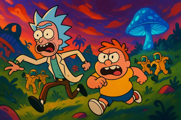
Step right into the fever dream of fake meds, wild labeling, and packaging so outrageous it almost belongs behind a pharmacy counter. “Common Side Effects” doesn’t just lampoon the pharmaceutical world in its storylines. The show dives right into pill bottles, pops them open, and lets the satire spill everywhere. The prop team, led by Camille Bozec, cooked up forty – yes, FORTY – distinct fake pharmaceuticals for season one. This wasn’t some copy-paste job, either. Every pack, bottle, and blister sheet snapped with detail, jokes, and sly nods to the viewers paying attention.
A Side Hustle in Satire
Ten weeks. That’s all the time the prop department had to spin up an entire fictional drugstore’s worth of products that look like they walked, or shuffled, straight off your local pharmacy’s shelf. And wow, did they deliver.
Not only did these designers study real-world pharmaceuticals, but they also deep-dived into everything from FDA labeling laws to generic brand typography disasters. Because, admit it, some over-the-counter bottles you see probably look less coherent than Marshall’s ramblings on a full moon.
But here’s where things get wild: every “medication” has layers. And we’re talking onions, not fancy cakes. Each label, each pill color, and each shape serves a joke – or sometimes a hidden bit of social commentary.
Peeking Behind the Pill Bottles
Okay, let’s paint the backstage picture. Camille Bozec assembled a small but feisty crew of designers, illustrators, and copywriters. During those first brainstorming huddles, the team taped up photos of real medication packaging. Think: Advil blisters, blue Tylenol caps, prescription printouts. They even gathered samples and snapped reference photos at actual drugstores, ducking past suspicious cashiers.
But after those serious first drafts? All bets were off. Instead of “acetaminophen,” you got “MoodElevate”—a supposed antidepressant with pills stamped with ridiculous smiley faces. Suddenly, the concept sketches grew bolder. Blister packs warped into zigzag shapes. Vials gained long, thin, pink droppers. Somewhere along the way, a bottle for “Panacea Plus” arrived, touting a cure for everything but – wait for it – existential dread, which naturally ended up hidden in the fine print.
How the Process Actually Unfolded
Let’s break out the bullet points for the design workflow, because this team means business:
- Everyone begins with research. The crew nose-dives into medical packaging, old and new. They trace the evolution of tamper-proof bottle caps and neon warning labels.
- First round? Parody. They create “basic” medicine branding, then pump up the ridiculous side effects or throw in extra legal mumbo-jumbo. Your average allergy medication suddenly claims to reduce “interdimensional malaise.”
- Visual gags are layered in. Illustrator-edited capsules feature polka-dots and animal prints. Boxes and bottles use comically oversized QR codes or slogans like “Side effects may include: Side-eye from strangers.”
- Team feedback fuels tweaks. Writers and animators chime in. Occasionally, legal steps in, gently reminding them that one label looked a bit too much like a famous real-world cholesterol drug.
And don’t think the fun stops at label design. Designers built out 3D mockups, placing boxes in character medicine cabinets or hospital supply rooms. Eagle-eyed viewers sometimes catch the same “MigraLite” pack migrating from Frances’ purse to Marshall’s kitchen – yes, that detail is a deliberate running gag.
Satirical Commercial Mayhem
Of course, fake bottles and boxes only tickle half the senses. The team also pumped out satirical TV commercials to be sprinkled across episodes. If you’ve seen even one in-show ad, you probably snorted a laugh. One classic spot hypes up “SleepTight” with a tired dad who crashes onto his living room floor while chaos unravels around him. The narrator’s syrupy voice boasts of side effects like “light levitation and uncontrollable yodeling.”
Animation director Olivia Jean stepped in with her own ad twist: she insisted each spot have unique animation flourishes. Bubbles erupt mid-sentence. Background extras lose all focus and begin floating across the frame. Commercials end with hushed rapid-fire monologues, packing in every conceivable side effect.
Label Easter Eggs: A Treasure Hunt in Every Frame
Now, let’s talk about those hidden jokes – because the prop team really understood the assignment. Camille confessed in a recent ScreenRant interview that some labels took twice as long because the writers wanted to squeeze in at least three hidden puns per bottle.
So, what did fans catch?
- “AllergyReliefRed” comes with a line: “Caution: May cause spontaneous confessions at family gatherings.”
- “ThinkAgain” brain-boosting chewables tease: “Warning: Not responsible for paradoxical enlightenment.”
- “SmyleStripz” claims: “Do not use if you’ve seen the original ending of ‘La La Land.’”
- Some microprint is nearly invisible unless you freeze-frame and zoom in – inside gags about other Adult Swim shows, or nods to podcast hosts who cameoed in crowd scenes.
And do yourself a favor: the next time someone pops open a medicine cabinet on-screen, look for the “FDA Approval Pending Since 1999” stamp. That one came straight from the writers room during a 3AM snack break.
Commercial Voiceovers You Might Recognize
While satirical writing shines, the voice talent seals the deal. Several mock-med ads feature recognizable voices from the Adult Swim comedian pool – think John Early, Patti Harrison, and even producer Mike Judge himself.
Mike Judge’s cameo? He voices the “expert” doctor in the XenoPhil commercial, trying – poorly – to explain why glowing in the dark isn’t a side effect, but a “life upgrade.”
The Hard Work Behind the Med-Mayhem
Of course, this scale of world-building came with challenges. The team faced a pretty relentless schedule. Some weeks, they needed to churn out six entirely new mock brands – each requiring logo design, color palette, fake ingredients, “official” warnings, and sometimes a matching animated ad.
Camille described many late-night moments of delirium, when designers debated whether “PuritiZorb” should have a holographic rainbow pill window, or if “DreamWeave” sleeping patches needed glittery edges. The wildest debates apparently happened around what exactly a “NanoDose” patch could plausibly look like – half the team argued for subdermal circuitry, the rest lobbied for something “that looks edible.”
Crucially, everything needed to walk a fine legal line – not so real it could actually fool people, but grounded enough to conjure up the awkward, soul-less branding you find sitting in the back row of every drugstore aisle.
Fans Spot Every Detail… and Want More
Social media, inevitably, went wild for all this. Reddit threads hum with freeze-frame hunts for new label gags every episode, and some fans have begun crafting homemade versions of the show’s medicines. Little toy blister packs of “HappyCap” now pop up on Instagram, complete with scribbled warnings about “narrative whiplash.”
Somebody even printed a set of “Mindspark” gummy vitamins and left them in a local community fridge – just don’t eat those, obviously.
Why It All Works
At the end of the day, “Common Side Effects” sells its world because the folks behind the scenes sweat the details. Even a split-second shot of a pill bottle gets the same care as a main plot twist. It’s that whiplash blend of ultra-real and totally absurd that gives the show its signature zing.
The prop team built a visual playground. They toss in gags for the sharpest-eyed fans, but they also make every frame feel packed with genuine, lived-in texture. And for those who hunt Easter eggs, there’s always a new detail to laugh about long after the credits roll.
Next Time You Pop a Pill…
You might think twice about the label. Blame Camille Bozec and her brilliant crew. Thanks to their work, the world of “Common Side Effects” feels hilariously – and sometimes eerily – real. So, pause, squint at that next medicine bottle in the show, and see what kind of side effect you stumble into. There’s bound to be a punchline waiting, blurry microprint and all.