Honestly, if you blink during the twelfth minute of the “Common Side Effects” pilot, you’ll miss it: a forest exhales magenta fog – all at once, the world aches electric and mysterious. That’s not a happy accident, or a coloring gone wild. No, this shroomy magic belongs to Wes McClain, the art director from Green Street Pictures who’s been tripping the light fantastic, frame by frame, ever since Bandera Entertainment picked up the show.
If you’ve been lucky enough to binge even a single episode, you know: the CSE universe is anything but ordinary. And so much of what makes it sing – or, rather, what makes your retinas jitter and your jaw hit the floor – starts with McClain and his team’s weird, wild, wonderfully careful vision.
Meet the Color Wizard in Residence
Let’s hit rewind. Wes McClain isn’t some studio – bred paint – by – number guy. He started out at Titmouse NY, wrangling storyboard clean – ups for “The Midnight Gospel,” and cut his teeth on the kind of hallucinatory animation that keeps colorists up at night. But that was just the prelude. In 2021, he landed at Green Street Pictures, and things got psychedelically serious.
Rumor has it, the team’s earliest brainstorming session carried the legendary codename “Pharma Acid Western.” Somehow, that makes perfect sense. McClain pitched a “botanical – neon” palette for CSE, and the crew rolled with it, hard.
He didn’t come alone, either. McClain wrangled a globetrotting crew – 22 different languages on the Slack chat, spread across five time zones, and probably ten times as many jars of instant coffee.
Brains, Brushes, and a Palette That Doesn’t Sit Still
Here is where it gets wild. McClain claims he built Season 1’s color script on a “triadic base.” That means: electric teal, bruised magenta, and mineral orange. You see these shades, and you just know – nobody else in TV animation is splashing colors like this. In other words, CSE pops.
Oh, and that’s not just for show. Every hue, every palette swap, ties right back to the show’s nerve – jangling themes and chemical twists. In a 2023 Variety panel, McClain summed it up: “Every shade in CSE is a side effect. You shouldn’t feel calm looking at our pinks; they ought to buzz in your molars.” Mission accomplished.
But wait, there’s more! He built the rules tight: absolutely no pure black allowed anywhere, ever. “Darkness in this show still has DNA,” he told AWN in a March 2025 interview. “It’s more like looking into a microscope slide than a void.” For the color nerds, the deepest shade in the show is a rich #0C0C14. Go ahead, check your Photoshop swatches and squint.
Designing Worlds That Shouldn’t Exist (But Now Totally Do)
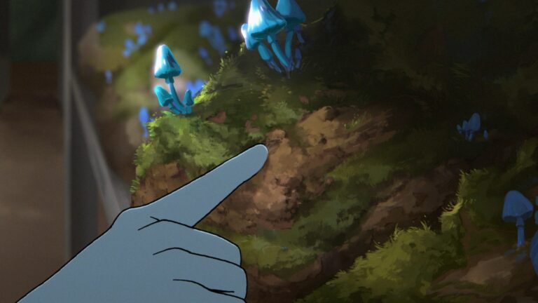
You’ll never see a boring “establishing shot” in this series. Every environment is wired for impact. From plush, amoebic forests where the infamous Blue Angel Mushroom blinks at you, to the “Data Cathedral” of Reutical Pharmaceuticals (think: gothic arches, but if they could measure your heart rate), McClain’s designs keep the story pulsing.
At NY Comic Con, McClain and VFX boss Jerome Lachance called out episode four as the ultimate “fever dream.” The line – boil in the backgrounds runs at 18% jitter – so even the wallpaper seems to breathe, swell, and stress out right alongside the characters. The animators actually loaded 3,600 hand – drawn mouths into the trees, morphing in and out of the viewer’s subconscious. Paranoia by design!
CSE’s backgrounds never just sit still. Bullet points time, because there are legitimately too many highlights:
- “The Bloom” in Episode 6: Mass hallucination. Backgrounds spiral using MRI scan motifs. Kaleido – ramp effects rendered in After Effects, courtesy of the FX crew.
- Reutical HQ: Starts stark, sterile white, but as the plot gets tenser, those walls “glitch” toward sickly yellow. Corporate evil, told by color.
- Suburbia: Bubble – gum pastels by day. After sunset, these candy clouds “curdle,” and everything safe starts to rot.
Even when things feel subtle, they aren’t. Take Episode 1: scan through McClain’s Instagram (@WesWorks) Valentine’s post. The frame keys spin between “candy – shop reds” and “hospital greens”—a shorthand for the entire show’s vibe.
Theme and Art: Not Just Friends, But Soulmates
The real layer – cake here? McClain’s art doesn’t just color CSE – it threads into the very bones of the narrative. Let’s break it down.
Science vs. Spirituality: The palette splits in two. Cold lab blues and jaundiced lights in Reutical’s empire dissolve into those warm, fungal neons whenever anything otherworldly creeps in. It’s right there in the color; you always know what side of reality you’re on.
Unintended Consequences: Check out the freckle motif. Cute? Sure, but also insidious. Spots first dot character cheeks, and later swell into stippled clouds or menacing side – effect blooms. The texture multiplies as every “cure” gets more bizarre.
Commodification of Nature: This one’s clever. McClain winks at corporate greenwashing by boxing in the background greens. Whenever a company exec stomps onscreen, natural foliage morphs into VR – terrariums. The greens themselves mutate, from earthy #39BF2B to lurid, plastic #00C84F. So even the plants sell out.
Friendship Under Chemical Strain: CSE doesn’t do plain – old dialogue scenes. The show layers colored aura – halos around the leads: Izzy glows orange, Harper sparkles blue. When tensions spike, those halos literally invert, so the emotional punch lands as a color punch.
From Mood Boards to Micro – Dosing: How the Work Actually Happens
Let’s get nerdy for a sec. How does this stuff get made? The pipeline runs on pure hustle and a bit of digital voodoo:
- Animation tools span Harmony (character work), Blender’s Grease Pencil (backgrounds), and custom After Effects plugins for that zany particle FX.
- Every week, a scattered 14 – person color brigade swaps files from Reykjavik to Sydney – remote work put into overdrive by pandemic shutdowns (but apparently way more memes).
- Texture stat: 78% hand – painted in Procreate, the rest built procedural in Blender. Total file hoard: 6.5TB. (They store it in Iceland. So it stays cool, literally.)
And, for flavor: not a single shadow in this series is pure darkness. Shadows must “glow.” McClain sweats every hex code. There’s even a video, still viral on TikTok from @GreenStreetLabs, showing background fungi “winking.” That’s FX artist Carla Noda – she animated the blink cycles at 12fps, so the lag makes your skin crawl.
The Crew That Makes the Colors Sing
McClain isn’t alone. The international squad at Green Street Pictures calls itself #puddingbrain (really, check Slack). Producers, like Hannah Joo, once sent a 2AM message—“What if the lake is actually the inside of a contact lens?”—and the next week, there it was in episode dailies.
Other studios, like Le Cube in Argentina and Mighty Nice in Sydney, dropped in their touch. That global spice means every episode can twist style and mood – sometimes within a single scene.
Carla Noda, again, gets a shout – out for inventing the “spore burst” look. Her After Effects preset? It clocked 7,420 keyframes per episode, and that’s not a typo.
What the Internet Thinks (Spoiler: They’re Obsessed)
Look, you don’t even have to trust us. Scan any fan thread – reddit’s r/CommonSideFX or TripTok, where hashtags like #SideFXTrip and #TealIsASideEffect trend each Friday. Critics, too. Animation Magazine drooled over the “psychedelic precision” and “MRI – scan beauty.” Even the Netflix HDR folks tried to put the brakes on the show’s “color – bleed gag” in Episode 2 (the peak was 112 nits, if you want tech bragging rights).
One more for the true fans: at the end of every episode, you get the “stinger card.” Retina – burn yellow, Helvetica font, and the jolt slams your brain right back to the living room. McClain fought for that little slice of color whiplash. He says it’s his love letter to all the viewers who feel “chemical hangover” after the credits roll.
What’s Next Before the Next Trip Kicks In
Before you stagger off for more cold water or rewind to catch another accidental mushroom wink, know this: Season 2 is already bubbling. As of January 2025, McClain has his hands on even stranger toys as Creative Director for Visual Development. The team hints at “double exposure hallucinations.” More spore bursts. Fewer bores.
So while you might think you’ve seen every wild trick CSE’s palette can dish out, trust me, McClain and company have only just begun to stir the chromatic stew. Grab your sunglasses, maybe a backup heart rate monitor, and keep your finger poised over pause. You’re going to need every second to catch every sly, shape – shifting miracle packed into Green Street’s painted world.
Fade to Neon
If your eyes are still adjusting from CSE’s glow, same here. There’s really nothing else on TV that looks or feels or tingles quite like it. That’s no fluke. That is the rare magic that happens when a visionary like Wes McClain gets a budget, a trusted crew, and a ticket to Dreamland. The result: a world that ripples, pulses, and always, always, keeps you guessing which side effect comes next. Stay color – corrected, folks. This trip’s far from over.